
What role can numbers play in fiction? In any kind of writing come to that? The obvious roles are:-
1. Word Counts
Whether you’re writing flash fiction or a standard length short story for a woman’s magazine, word counts are vital. I use Scrivener and love being able to set my word count target and watch a bar change from red to amber to green as I approach my mark but I am geeky like that.
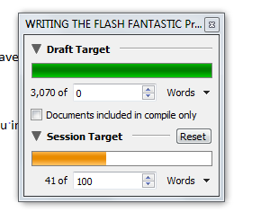 |
| Part way through a writing session and I can see how far I’ve got to go. Image by Allison Symes |
The good thing is I never go over a word count limit as a result. I remember the days of having to count manually, though the old tip of counting the words in one line by the number of lines in a page by the number of pages you have does give a general idea of where you are.
These days, of course, you should be precise and Word works as well for counting (though it doesn’t have a bar changing colour! In fairness, that’s not the only reason I use Scrivener but I like it all the same!).
 |
| Numbers play more of a role in creative writing than you might think. Image from Pixabay. |
Top Tip: I take off 10 to 15 words from the official word count. Some competitions I enter include the title as part of the word count, others do not. I play safe. Nobody has a 10 to 15 words title (it would be far too much of a mouthful!) but taking that number of words off does mean I always come in under the required limit regardless of whether the title is part of that limit.
 |
| I’m sure we’ll soon change the “unwritten” bit for the year, won’t we? Pixabay |
2. Publisher Submission Requirements – Numbers in costs and measurements
There is a good reason why publishers want work submitted, say, in Times New Roman, font size 12. It’s not a contrary requirement. They’ve worked out ages ago what works best and it’s down to reducing production costs as much as possible.
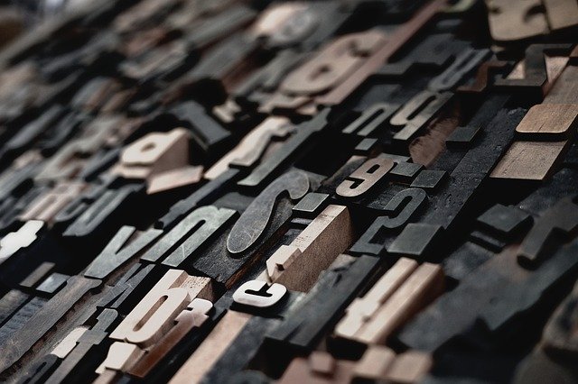 |
| It’s amazing how many different font sizes there are and what a difference these make to production costs. Image by Pixabay. |
Fonts vary in size. Just try using Bookman Old Style in size 12 compared with Calibri (which is what I drafted this piece in) and note the difference. The image below is one I used for a recent Chandler’s Ford Today post where I looked at this topic in more detail. You will literally see what I mean. The bigger the font the more paper you use, the higher the production costs. Far simpler and more cost effective to have an industry standard.
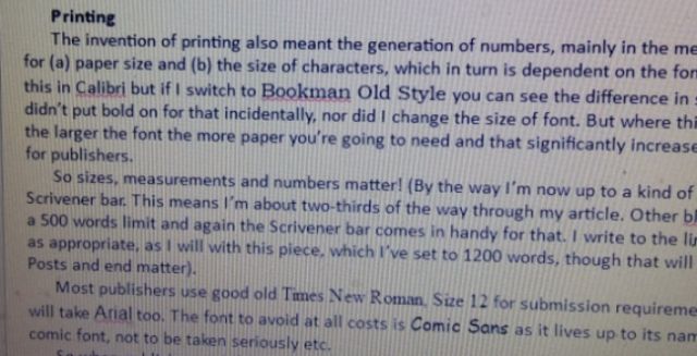 |
| You can see the difference in fonts here, even though all of them are at 12 point. Image by Allison Symes |
3. Dates!
Well, they do include numbers and the golden rule of course is to never be late with a submission.
Top Tip: I take at least a week (and often ten days) from the official competition deadline. Why? So I have time to make final tweaks (there always are some!) yet know I will still submit in time because I will submit that piece on my deadline and not the one the organisers have set.
 |
| Good thoughts here but a useful idea is to set your own deadline ahead of a competition/publishing one. Image from Pixabay. |
Oh and I do practice what I preach. I set my deadline for getting this piece ready for More Than Writers for mid-January though it is not due to appear until now, the 29th!
 |
| Give yourself plenty of time ahead of any deadlines. Pixabay. |

